"Kill The Hunger Pains" feat. Philadelphia
Every couple of months we like to challenge the team to create something that pushes their creativity with an almost limitless brief. We say almost because we try and stick to one day and utilise the kit we have in house - this encourages innovation and creative thinking. But when it comes to what we’re filming, it’s open to all ideas.
This time around, our project "Kill the Hunger Pains" combined a love for both horror films and food! We wanted to make something that challenged our lighting, sound design and storytelling skills, whilst subtly promoting a household brand that we're all fond of.
Enter, Kraft Foods Group’s, Philadelphia cream cheese.
Pre-production
It all starts with an idea. An idea that can be written down and fleshed out until it really works. We put some rudimentary storyboards together in order to share the concept with the wider team and ensure everyone is on the same page. This is something we do with every project that comes through the Dead Pixel door. We don’t always opt for the hand-drawn style as we like detailed references from the internet to be able to explain the shot & style with clear mood boards; providing a great way of communicating an idea clearly.
Location
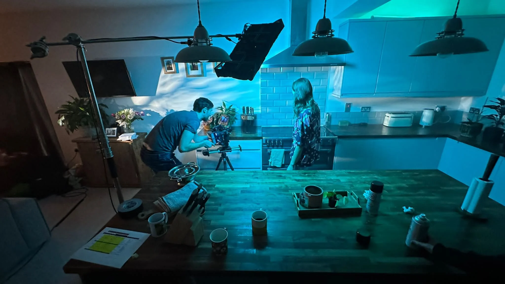
We sourced a kitchen location that had a large wooden island and could easily be blacked out in order to control the lighting. We needed a large space to add depth to the background rather than being pushed up against the walls. This was done with set dressing and various lighting techiques (we come onto that in a moment). Having a big location also helps when popping up light stands, monitors and bringing in a film crew (we always need more space than you might think).
Lighting
During pre-production, we put together a lighting plan off the back of detailed storyboards to ensure the setup time was kept to a minimum and allowed us to focus on the action and camera moves.
We used the Aputure 300D with a blue gel attached to the spotlight mount to act as our moonlight through the trees on the wall. We then used the RGB Aladdin 2x1 to act as a key light that we could easily boom in slightly overhead and move around when necessary.
We had two Astera tubes courtesy of our friends at Promotion Hire that we occasionally used for fill or to bounce off the roof to bring up the shadows slightly.
Camera and lenses
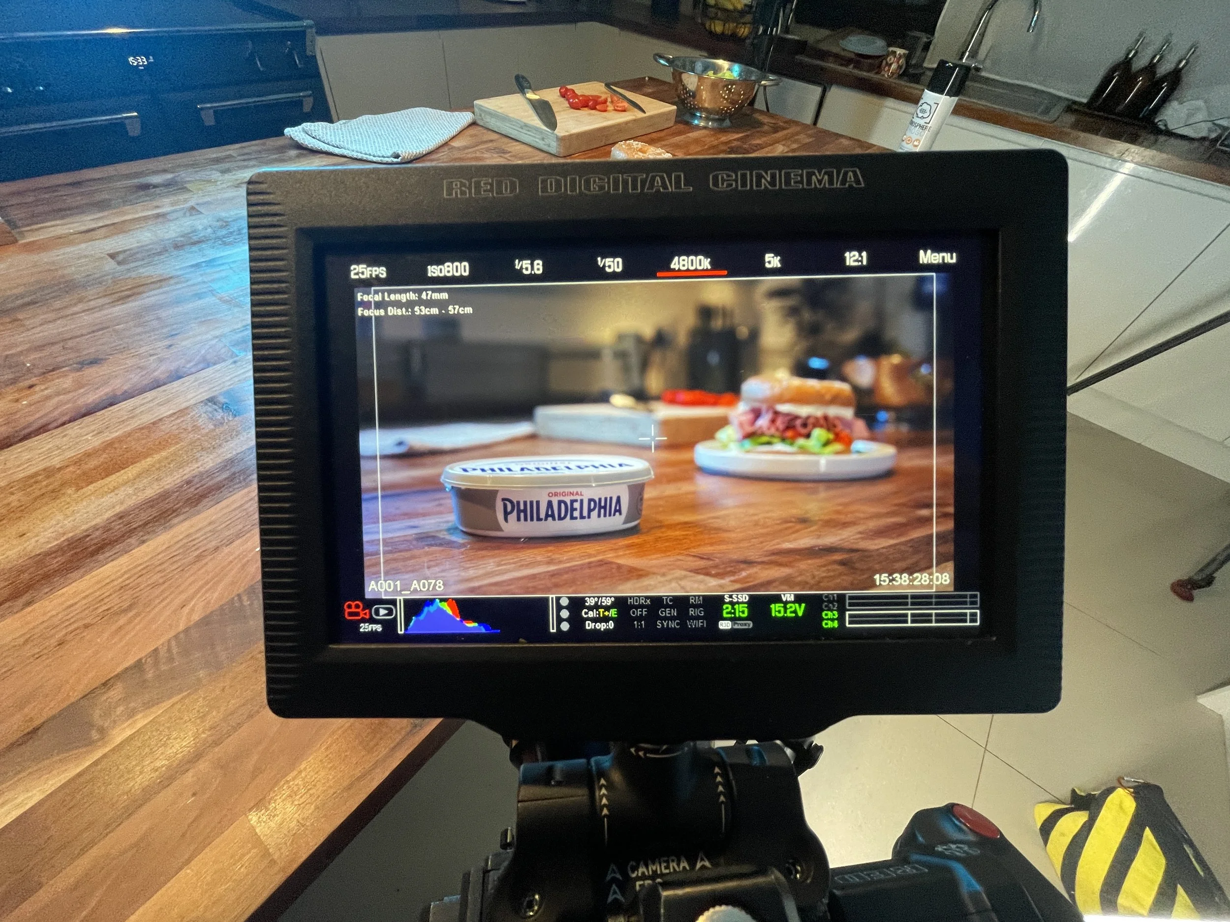
The look was always meant to be wide and exaggerated. To achieve this effect we used the Samyang 14mm and laowa 24mm probe. The probe is 2x macro lens, meaning you can get incredibly close to any subject and it looks twice as big in the frame. The challenge with this is that the lens starts at F14 which, for a dark moody set, starts off looking like we’ve left the lens cap on.
To combat this, we had to bring in powerful lights close the subject in order to expose the images and boost the ISO slightly on our RED Gemini camera to compensate for the low light.
Styling
Whilst this concept heavily leans into the dark, moody lighting it ultimately still has to be about the food. We filled the toasted bagel with Philadelphia cream cheese, ham, lettuce and tomatoes -beautifully styled by our in-house creative producer, Sarah Hancox. Don’t worry, there was no food wastage at the end of this shoot, just a well-fed film crew.
Sound Design
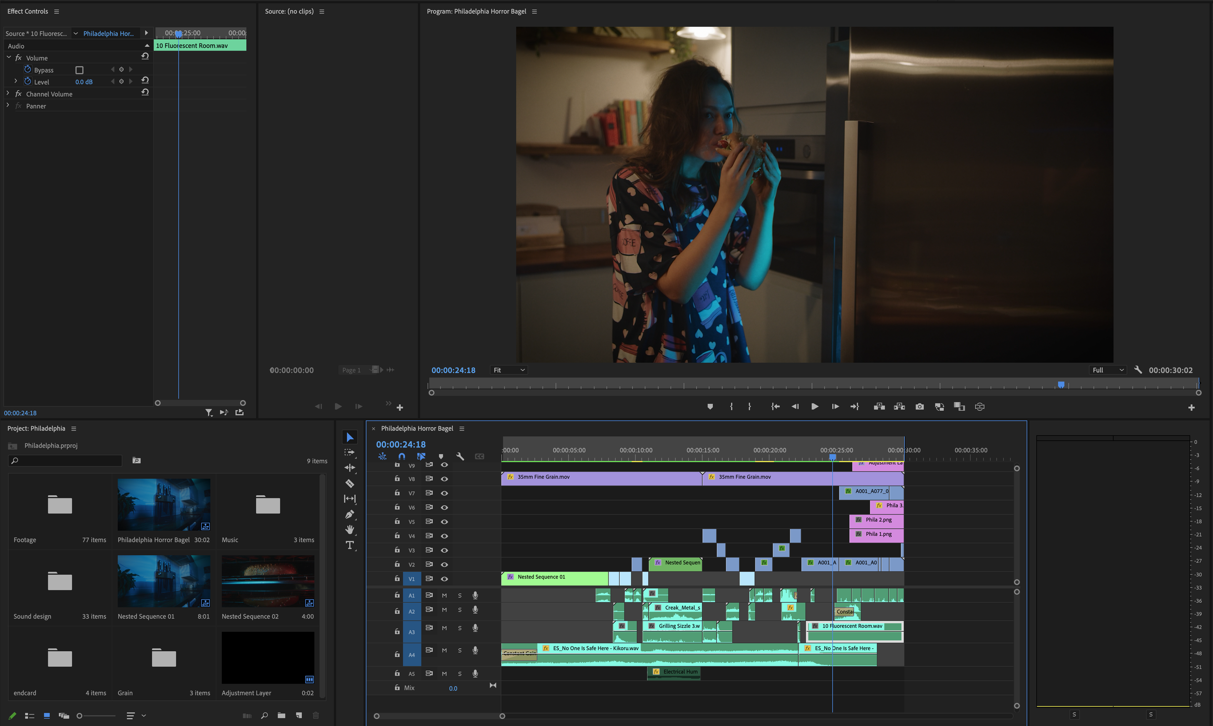
The foley was pivotal for this type of project leaning into typical horror effects you'll probably know and love whilst flipping things on their head when combining this with food.
For example:
When the lettuce is being washed you'll hear subtle gargling / drowning sounds.
When the bagel is being toasted, we used hot metal creaking sound effects in a dark and torturous way.
We used a stab-in-flesh sound effect for when the consumer inserts the knife into the cream cheese.
This was all layered in with tense tones and droning sound effects to keep the audience feeling uneasy.
All of this was very much a creative license to create something people may not have seen or heard before.
Check out the finished film here:


